After what seems like a long hiatus due to traveling and a cold, I find I am itching to get back to my blog but more importantly, to creating.  Yesterday was largely devoted to knitting whilst watching HGTV, which I will most likely blog about at a later date if the project I’m working on turns out all right.  On the jewelry front I am finally able to put some energy into my new line which I hope to blog about in the coming days and weeks.

So, in absence of any new work to show, I was looking through my jewelry photographs and found some photos of my PMC work completed in the last year or so.

Leather Bead Bracelet


This leather bracelet is comprised of a single PMC bead and “clasp.”  The clasp is actually more of a button–this technique could easily be modified to use a button in fact.  Good thing I raided my grandma’s vintage button collection when I was last in Oregon. 


Geometric PMC Earrings

These earrings are a combination of PMC and sterling silver.
 
The large shapes are made of PMC of course, but they could almost as easily be fabricated in sterling silver sheet.

Flower Pendant

This pendant was sculpted in PMC, fired, then oxidized and polished.  I sold it quite awhile ago, but it remains a favorite piece.

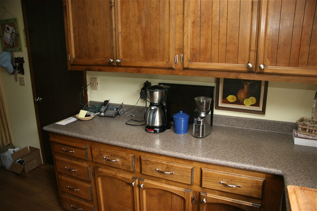
See living room and kitchen before/afters here.

I’m a little sad because the most dramatic transformation in the Oregon house took place in the bathroom, which was hideous when we bought the place.  Mick did so much work in there, re-tiling the floor and adding heating to it, re-tiling the bath/shower area, replacing the toilet and vanity.  The only thing I did was cut tiles and paint.

Mick, of course, was proud of his handiwork and took loads of pictures of the finished product which for some reason we can’t find.  So I’ll have to do a more detailed before/after of the bathroom when we go back and get more photos.

In the mean time, here are a couple of photos of the transformation:

Before:

During:

A little progress:

After:

My initial thought when I saw the bathroom in this house was gut it. The yellow bathtub really didn’t seem to leave much of an alternative.  But there were practical considerations of course, the first of which being cost.   Then there was labor–removing a bathtub can be an arduous process, sometimes requiring the removal of walls.  My next thought was resurfacing or a liner.  There are companies that take molds of your bath/shower and then create a liner to fit over the existing tub and surround.  We did meet with someone and almost decided to do it, but Mick thought it was too expensive and it was going to take many weeks for the order to be fulfilled.  Plus, it was rather generic looking and for me didn’t have a lot of design appeal.

Awhile back I’d seen an HGTV program which involved a bathroom re-do.  In it, the bathroom had a lot of tile work that was outdated but still in good condition and not cost efficient to replace.  The designers decided to incorporate the tiling in the design as if they’d chosen it.  The overall result was not necessarily to my taste, but the idea stuck with me and I decided to use it in this bathroom design.  Pretend I’d chosen the horrible yellow tub and work the design around it to minimize it’s impact while allowing it to harmonize with the rest of the room. 

One of the best features of the bathroom is the natural slate floor with heating underneath.  Here is a look at the old, ugly, floor:

And here is a photo of the slate (which doesn’t give much of a look–sorry):


The master bedroom is probably my favorite room of all.  When we first moved in, I decided to paint it a kind of aqua blue color to coordinate with some pillow I bought, so some of the before photos show me painting it blue:

Unfortunately, Mick and I spent one night in the painted room and decided it wasn’t going to work.  So we repainted it a soft white color:

The biggest change in the room was the glass sliding door.  We replaced it with a single door with panels on each side that open.  It has a french-door look but isn’t as wide.

This, of course, is the bed with the new headboard, which we completed the last time we were there:
Another change in this room was the closet, which we had replaced with mirrored doors.  It really opened up the room:


Finally, here is the guest bedroom, which also functions as Mick’s office when we’re there:

This isn’t the greatest "after" picture, but it does give you an idea of the changes we made:
This is a photo of our neighbors.  Yes folks, a grave yard lies right behind our backyard fence.  I actually kind of dig it (tee hee, get it, dig it)?  It’s fun to explore.

A lot of you know we bought a second house in Oregon last year so I could spend more time with my grandparents:

I have had lots of fun re-decorating it, and I thought I should post some before and after photos to show what we’ve done.

When we first got the house, it had some pretty horrible carpeting and needed a paint job.  The first thing we did was paint the living room, kitchen, dining area, and master bedroom.  Then we had the carpeting replaced throughout the house with laminate flooring.

Here is a view of the living room (from the kitchen) before:


and after:

We actually liked this sofa so much that we ended up buying the exact same one for our Santa Monica house.

Another view of this area before:


And after:

This is the dining area before:

After:


In the kitchen, we replaced the counter tops (with the Lowes equivalent of Corian, which I can’t remember the name of), sink, and appliances.

Before:

After:

Before:

After:

Before:


After:

My plan is to paint the cabinets white, but Mick is against this, so I’m not sure if I will do it.  As of now we’ve only changed the hardware on the cabinets, which did make a difference.

Tomorrow:  Before/After of bedrooms & bathroom

I was organizing files on my hard drive today and found some photos (albeit not great ones) of pieces that have been commissioned over the past couple of years.

I’m not actually a big fan of doing commissioned work because I feel so much pressure (got to work on that self-confidence) when I do it.  Most of what I do is for friends and family, but occasionally someone will buy a ready-made piece and then request that I do something custom for them.

The first piece is a cocktail ring hand-fabricated in sterling silver and set with Swiss blue topaz, which remains one of my favorite gems because it’s beautiful, yet relatively inexpensive, even for a sizeable stone:


Next, is a pair of earrings I made at the request of my friend Ruth for her mother’s birthday gift:


These are hand-fabricated in 18k yellow gold and set with crystal quartz and chalcedony.

The necklace below was commissioned by a woman who’d bought a similar piece on my website but wanted a second in greens and yellows.  In this case, I used peridot and lemon quartz:

She also requested matching earrings (apologies for the picture quality):


The photo below is of an unfinished earring designed and commissioned by a customer.  She sent me a rough drawing of what she wanted and I hand-fabricated it in sterling silver with a briolette of crystal quartz and cubic zirconia:

The finished earrings were quite large and very striking, with a lot of movement.  I used sterling silver leverbacks for the earwires, but I don’t have a photo of the finished piece.

Occasionally, I get requests from non-profit organizations to paint portraits for their benefit.  Generally they like me to donate custom portraits, where someone can bid on or donate money to the organization, then send me photos of their pet and have me do a custom portrait.  For some reason that’s not my preference though–I like to paint something, send it off, and be done with it.  When I paint for charity, however, I do try to paint portraits that would be attractive to a general audience rather than an individual pet owner.

The portrait below was painted for a cat rescue organization.  I chose a photo of my brother and sister-in-laws cat, Joey:


Joey Sleeps with the Fishes, acrylic on stretched canvas, 2003

I really liked this painting when it was done, and proudly called it "Joey Sleeps with the Fishes."  Unfortunately, the organization I was donating to thought that potential buyers might be offended by the tongue-in-cheek title.  "Sleeps with the fishes" implies a dead cat, afterall.  I reluctantly changed the title to "Joey Dreams of Fish."

In my heart, however, this painting will always be called "Joey Sleeps with the Fishes."  😉

Incidentally, I painted another portrait of Joey the following Christmas, which was intended to be a gift for my brother and his family:

Ball o’ Cat, acrylic on stretched canvas, 2004

Unfortunately, I’d neglected to prepare the canvas properly and when I varnished the completed painting it got completely ruined.   I was very disappointed by that since I really liked the painting.  Thankfully I photographed it before applying the varnish, so at least it still exists in the digital world.

Errr, I mean container garden.

Ahhh, it’s spring, that glorious time of year when I make a trip to the local nursery and buy new  plants for my balcony container garden that will eventually die from neglect. 


This is a blossom from my nectarine tree, which I’ve had for several seasons but have yet to get any nectarines from:

Here is the tree itself.  I love it, and it keeps coming back each year.  The fruit should come in July.  I’m keeping my fingers crossed.

My reading nook:

The view from the other side of the balcony:
And finally, the real reason for this post, before I got sidetracked by my gardening:


These are my Springtime Stack rings.  They are hand-fabricated in 18k gold and bezel set with pink tourmaline (left), diamond (center) and peridot (right).  While they were made to be worn together as a set, they are pretty on their own as well, especially the diamond.  They are some of the best examples of my work to date.

I am kind of in the process of developing a line to take into some local jewelry stores.  I say "kind of" because I haven’t decided exactly what I want to do, but I’m leaning in this direction.  Most of my jewelry sales have been online so this is a new and unexplored world for me.

The necklace pictured below is hand-fabricated in sterling silver and hanging on an oxidized and brushed sterling silver bead chain.  This particular work is a bit to rough for my liking, but it is definitely in the direction I want to go.  Lately I am loving brushed silver oxidized jewelry as opposed to my usual highly buffed and shiny work.


In keeping with my usual "jewelry with a message" style, peace, of course, will be the central theme of the line.  However, for various reasons I need to get away from the actual peace sign motif that I’ve been using so I am exploring other ways to express this in my work.  It doesn’t mean I won’t use it any more, it just means that I need to explore new ways to say it.

There are, I believe, different paths to peace and the first and possibly most important path begins with oneself.  To me, freedom of thought is an essential part of having peace of mind, and peace of mind is an essential part of promoting peace in ones own life, and ultimately peace in the world.

It will be interesting to see how this plays out.  I have lots of ideas, but at the moment, not a lot of time to execute them.  Spring/summer is such a fun time to create jewelry though because we are able to bare more skin and what looks better next to skin than beautiful jewelry?

I’ve been wanting to knit this shrug/scarf ever since I saw it.  Somehow I got sidetracked though and forgot about it until I was suffering a "what to knit?" crisis yesterday and pulled out all my knitting books.

This design is by Teva Durham from the book Scarf Style.  If you’ve ever thought scarves were boring to knit, then you haven’t seen this book.  Most of the designs in the book will challenge my modest knitting skills, however this particular design is fairly simple and it’s so cute.  I picture it paired with a tank top, although by the time I finish I’m sure it will be too warm to wear it until fall/winter next year.  That’s okay, it will keep.

The yarn I’m using is rather delicious–it’s Debbie Bliss Chunky Cashmerino in light teal.  I bought quite a lot of it for a sweater project that I haven’t blogged because I’m not sure if I’m going to do anything with it.  I’m not crazy about the finished sweater, though it was the first one I designed and I really should keep it (as opposed to unraveling it and using the yarn for something else).  Still deciding.

I started a new painting today–one that I think will take me awhile to complete since it is not my usual subject matter (dogs).

I started with a photo and a 12×16 blank canvas.  Based on the dimensions of the original photo (8×6), I penciled a 1 inch grid on the photo, then penciled a 2 inch grid on the canvas.  I then transferred my image to the canvas by sketching what was in each square of the original photo:

 
I decided to begin coloring my painting before finishing the sketch because my pencil was rubbing off as I drew.
This is a painting that will require many layers of color, so at this point the painting is very rudimentary, not much more than the sketch itself.

A bit more color:
 
At this point I kind of lost patience (as often happens) and I began coloring the entire canvas:

This isn’t entirely unjustified, as much of the remaining work is layering color over color, and I felt that painting the remaining base colors was the next logical step.

At this point I don’t have a lot of confidence in this painting, but it has miles to go before it’s completed.  Every painting I’ve ever done has a time when I’m certain it’s not going to come out right and then somehow I usually get it just how I want it.  We’ll see!

When I began painting pet portraits in 2001, my dogs Kramer & Stuart were my inspiration.  I quickly filled my house with paintings of them, and while these portraits remain some of my favorites, I harbored a secret desire to paint huge pictures of them to hang in my dining room.

It took a couple of years to get around to it, but when I did, it only took a weekend to do both of them.


Kramer,
acrylic on canvas, 36×36, 2003


Stuart
, acrylic on canvas, 36×36, 2003

I really like using latex wall paint for my portraits because the consistency is good to work with, especially for backgrounds.  After choosing the photos on which the paintings would be based, I painted each canvas with latex paint I had left over from painting rooms in my house.  Next, I transferred the images on to the canvases by drawing grids on both the sample image and the canvas (scaling up).  Using a pencil, I simply drew what appeared in each square of the sample photo in the corresponding square on the canvas.  This is a little tricky, but it actually went pretty fast and I was pleased with the result.

Once I had transferred my images onto the canvases, I simply painted in all of the details.  In some ways, the size of these canvases made the process more difficult in that it was harder for me to capture such important details as the expression in the eyes or the blend of the fur.  And truth be told I’m not 100% satisfied with the results, although these paintings have a central spot in my home and I love them.  And others love them as well–I get a lot of compliments from visitors and I’ve gotten more than one commission from people who know my dogs, have seen the work hanging in my own home, and want one for themselves or for a gift.

Besides, no pet lovers home would be complete without giant-sized portraits of their loved ones, right?  (Or am I just obsessed with my dogs?)